
It’s hard to tell you what good website design is.
So we’ll start off with a simple scenario and you’ll decide which is the better design.
Let’s say you were trying to search for a good tuition agency in Singapore for your child.
You came across 2 websites:
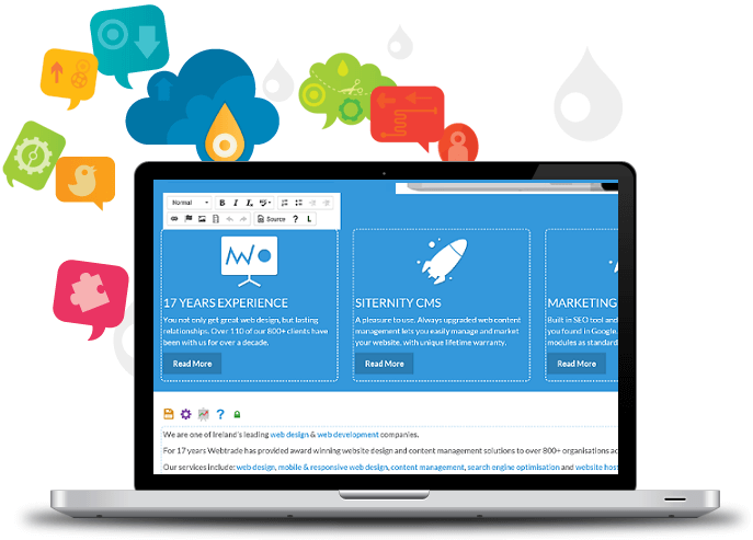
Website A:

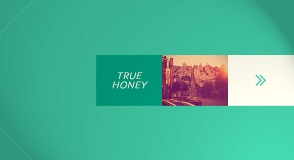
Website B:

Which website would you go for?
Well, it’s a no-brainer! Any given person would have gone for website B.
Often, our clients ask us what the cost of web development services in Singapore is, and we can’t help but tell them that you get what you pay for.
Even if you decide to continue on website A, how long do you think you’ll stay on it before getting frustrated and confused searching for the right information and the right buttons to click on?
On average, websites have a mere 8 seconds to get a visitor’s attention, and finding that right button or information would have lost you more than 8 seconds.
Furthermore, naturally one would assume that website B is a more professional tuition agency than website A (even if it isn’t).
So, even if you are a reputable tuition agency, or any other business for that matter, people judge by what they see.
There is however, more to responsive website design than just its aesthetic appeals – and that ties in the entire user experience.
Here are 6 key takeaways you’ll need of a good designed website:
1. Good Visual Design
When searching for a web design company in Singapore, this aspect of design is something everyone should be aware of – the visual appeal of your website.

Although some may say it is subjective, there are a few rules on visual elements you should abide by if you want your website to look appealing enough for everyone.
Visual elements include the logo, the fonts used, allocation of white space, its theme, layout and colors.
Firstly, find a theme that relates to your business and portrays the purpose or meaning behind it.
This will be reflected in the type of colors, font and images used.
It is important that these elements are easy on the eyes.
This includes avoiding mass-clutter, clashing colors and pixelated images.
A key tip is to keep it simple.
2. Meaningful Content Marketing Strategy
The content is important because, that is the main gist of what your readers will be looking at.
A lot of information on your company is good, but people won’t have time for that.
Your content should be straightforward and simple for everyone to read (no big jargons required).
Most importantly, include only the relevant information your users want to read i.e. “what’s in it for me?”.
3. User-Friendly Website Navigation
One of the more frustrating things that can happen in a website is you not being able to find certain buttons or go where you need to go.
This mainly involves the navigation or menu bar at the top of the webpage.
Again, this has to be uncluttered and simple to use.
Additionally, carefully group the right pages under the same topics to create ease in navigating information.
To make it even more straightforward, you can add elements such as arrows, lines, or make use of the hierarchy of sizes (e.g. big and small fonts or icons that direct to the final result), that goes through a natural flow of events that users will follow.
4. Call to Action Buttons
The call to action (CTA) is where your visitors “take action” on your website; whether it is to sign up for your service, become a member, or anything that you want your visitor to act on.
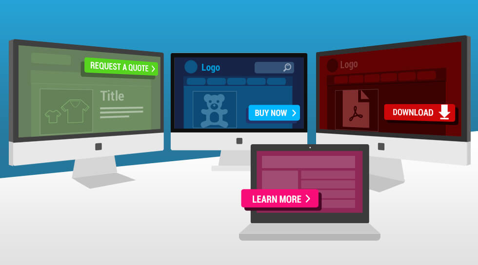
One of the key advise to a good CTA would be adjusting the placement, size and colors to make it noticeable and easy to act on.
An example would be placing a bright red colored button that says “Start Now” so that your users will know exactly what they are required to do.
The actionable words you use may also create impact or urgency to your readers.
The word ‘Today’ in “Create Your Website Today” subconsciously adds a sense of urgency for them to take action now.
5. Credibility and Trust Signals
There are so many websites out there, many of which you can’t really believe in.
Thus, a simple way to instill trust in your visitors would be to incorporate items on your website that backs you up as a legitimate resource.
Displaying of social proof, certifications, or security seals is one way of ensuring the safety or reputation of your organization.

Other simpler ways include ensuring that your content is grammatically correct with no spelling errors, and showing your identity and providing contact information.
6. Mobile friendly website design
It is evident that people are increasingly using their mobile devices for the internet – more than they would on their laptop anyways.
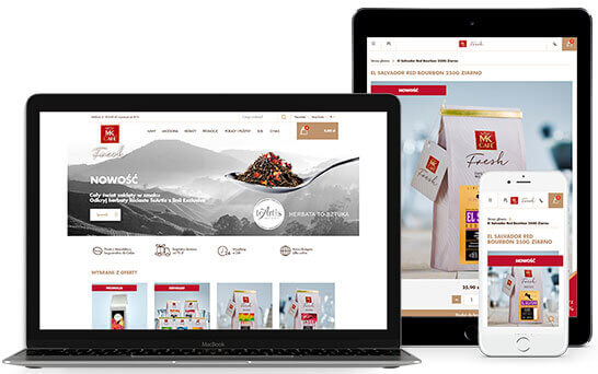
Thus, it is crucial that your website is convertible to a mobile interface.
A responsive technology framework would help designers in shifting designs accordingly to different screens.
Similarly, a clean and simple design with the usage of relevant icons would help in creating an easy and smooth user experience.
Conclusion
In conclusion, these 6 points create the basic guideline to a good website design; creating a beautiful and functional website that leaves a good user experience for your visitors, increasing the chances of a conversion.
Thus, if your website is missing some of these elements, or worse, looks like website A, then it’s about time you do something about it because you’re easily giving away free leads to your competitors in a matter of 8 seconds!


